Graphic Design
The links below are to the flipbook versions of the year end reports for Eaton Rapids Medical Center that I designed.
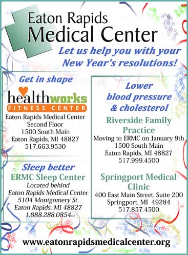
http://www.eatonrapidsmedicalcenter.org/2013connections/
http://www.eatonrapidsmedicalcenter.org/2012connections/
http://www.eatonrapidsmedicalcenter.org/2011connections/
![]()
This is a logo I did for an Eaton Rapids area baker. She wanted to have something simple that would work on tans and other light colors.
This is the artwork for a magnet that was designed to look like a bandage. It is also the same size.
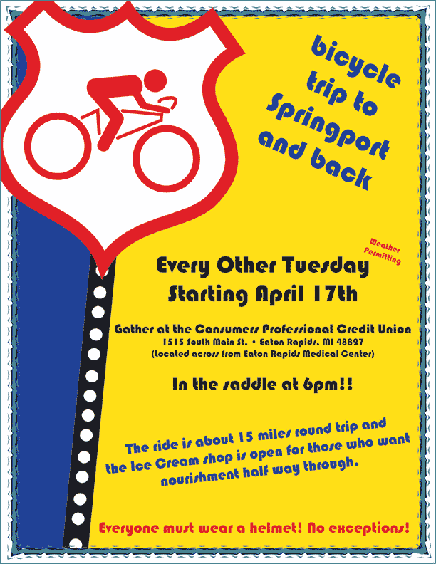
Below is a flyer for a local weekly bike ride. I almost had as much fun making it as I did participating in the ride.
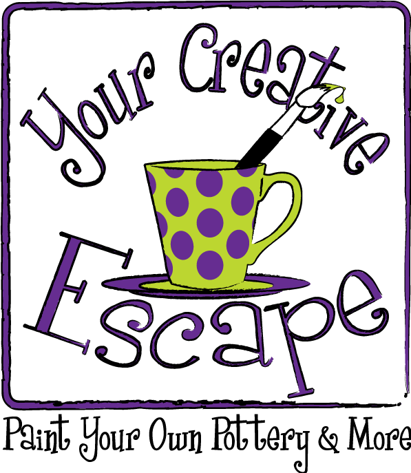
This is a logo I did for an Eaton Rapids do-it-yourself paint your own pottery business. The font used is called Girls are Weird, which is the business owner's favorite font style and she wanted it used in the logo.
![]()
This logo was designed for the 175th anniversary of Eaton Rapids Michigan. The main part of the town is on an island on the Grand River so they wanted elements of that in the logo. Eaton Rapids has several small dams and an island park that features a neat old gazebo.
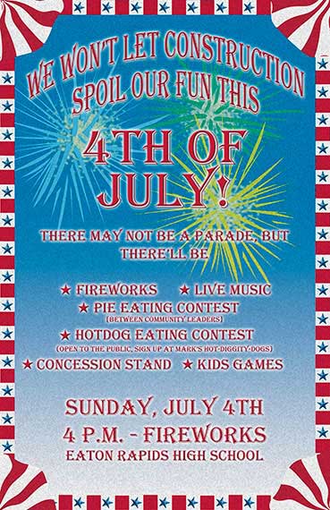 |
This poster was for the 2010 July 4th celebration in Eaton Rapids. I also designed a few newspaper ads and a flyer to go along with it. |


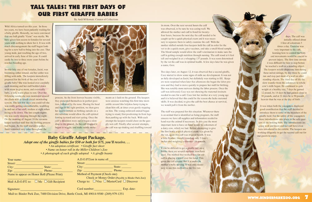
Above are two examples of covers for the ZooView, a magazine style newsletter. Below is a spread from the same series of newsletter.
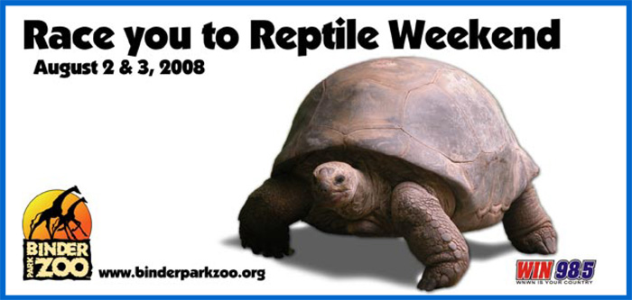
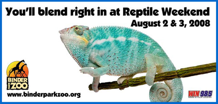
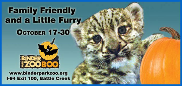
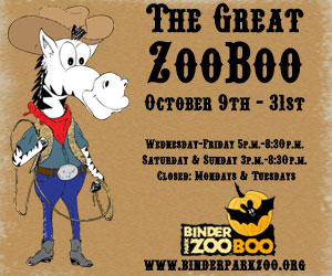
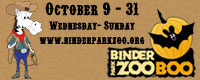
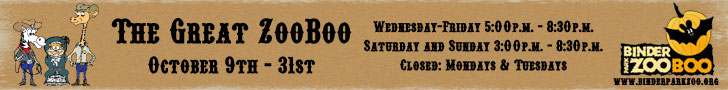
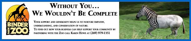
Below are a few examples of some billboards that I have designed.


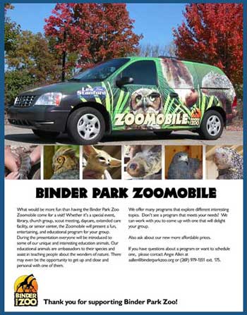
Above is an ad for an education program at Binder Park Zoo.
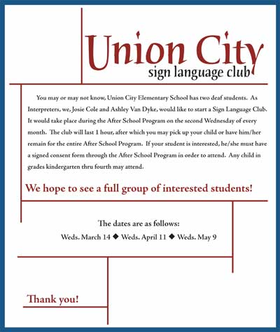
Above is a flyer designed for the Union City Sign Language Club.
Above and below are some examples of web banner ads.
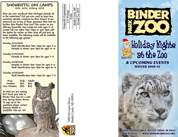
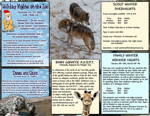
Above and below is the same tri-fold brochure design which is intended to be used in advertisement racks.
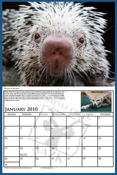
Above is a 11x17 calendar design for the Battle Creek AAZK. It is not from a template, it is my own grid and layout.